|
Design and Form: The Basic Course at the Bauhaus by Johannes Itten Thames and Hudson 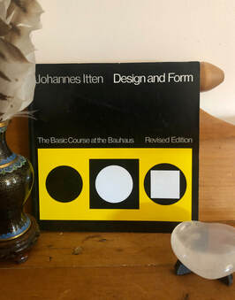 Recommended Read 'Design and Form: The Basic Course at the Bauhaus' by Johannes Itten (1888 - 1967), published by Thames and Hudson. A very interesting book into some of the basic theories of colour, tone and shape that were taught at the highly influential Bauhaus school, in the earlier part of the century. Most of the book comprises of images of artwork from artists of the time. Johannes Itten was a Swiss artist, writer, teacher and theorist and was part of the Expressionistic movement. He was Mazdaznan, a strict vegetarian and meditated to develop inner understanding and intuition. Originally he trained as a school teacher incorporating new theories of teaching, notably including the practice of not correcting his students' creative work individually, so as not to crush their creative impulse. He chose certain common mistakes to teach the whole class. From the influence of Hölzel, Itten chose a series of basic shapes (the line, the plane, the circle, the spiral) as a means from which to begin creation. His students did gymnastic exercises before class to relax! Later music and other relaxation techniques. Itten had a HUGE influence on the use of colour in modern art and even the cosmetics industry. He taught the preliminary course at the innovative Bauhaus from 1919 to 1922 - the basics of material characteristics, composition, and colour. He theorised 7 types of colour contrast. These were hue, value, temperature, complements, simultaneous contrast (Chevreuil), contrast by saturation, contrast by extension.
0 Comments
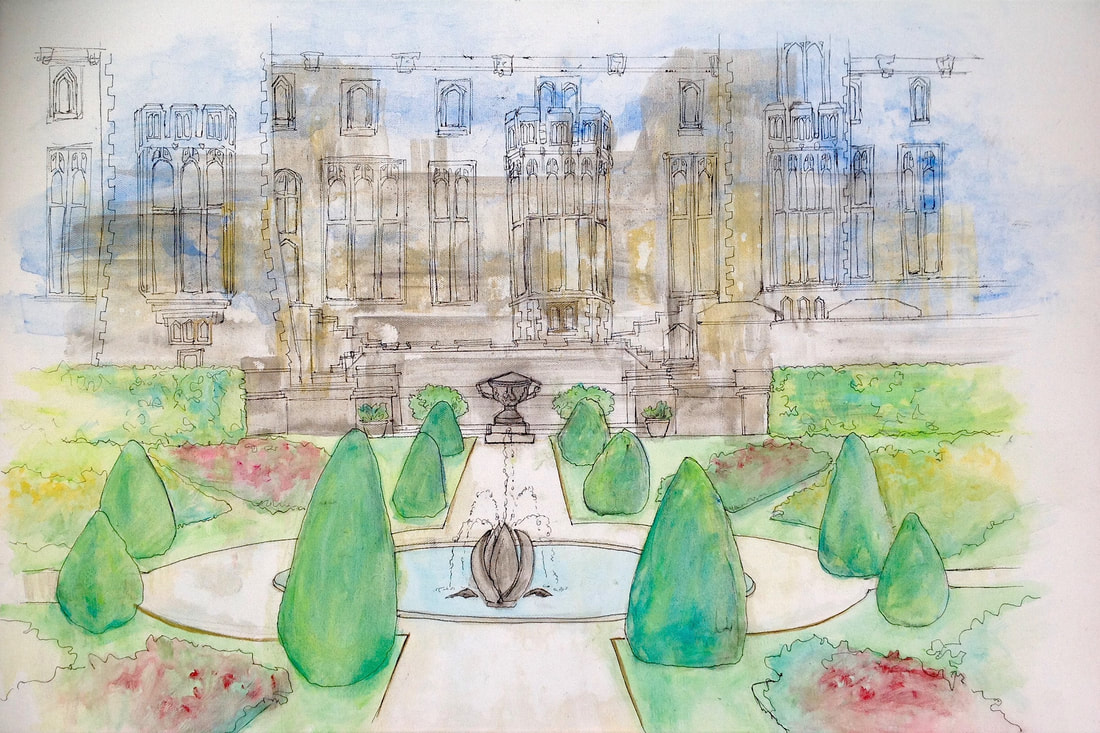
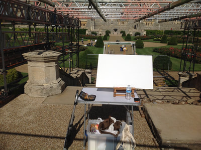
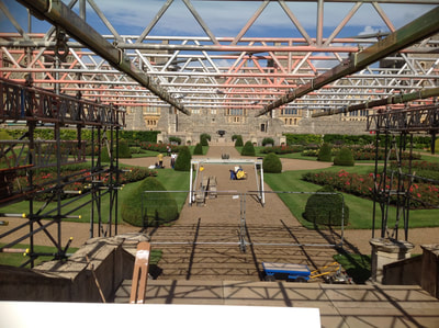
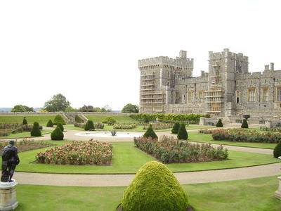
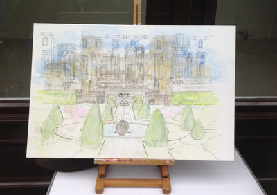
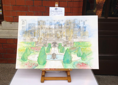
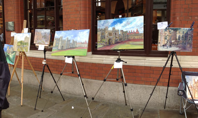
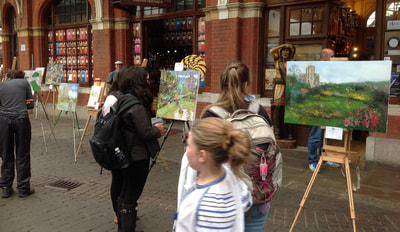
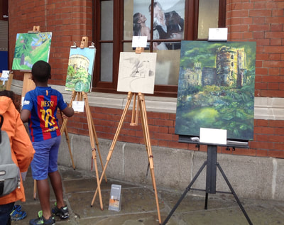
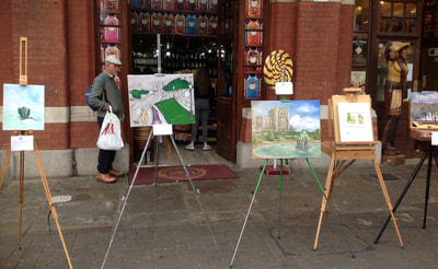
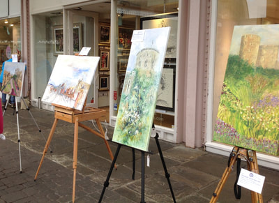
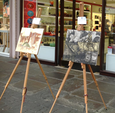
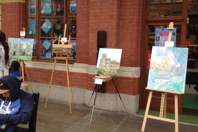
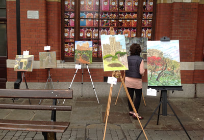
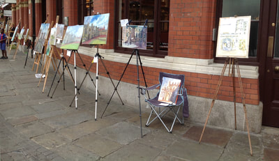
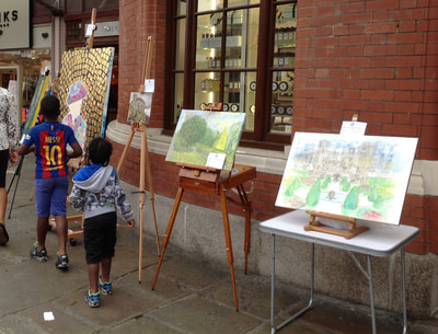
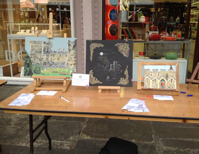
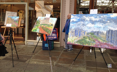
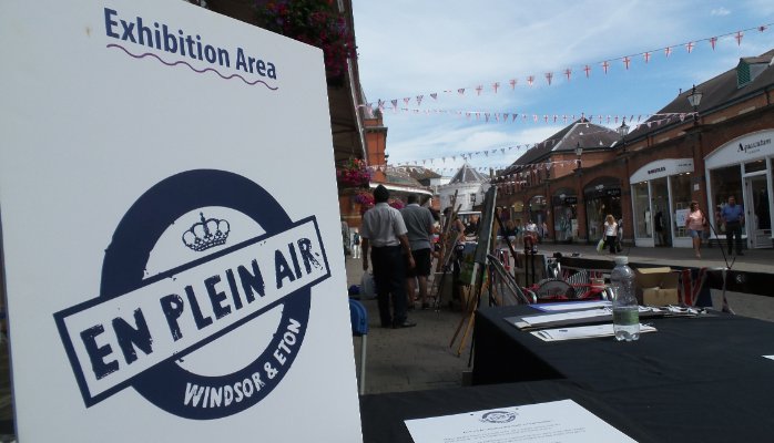
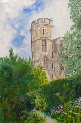
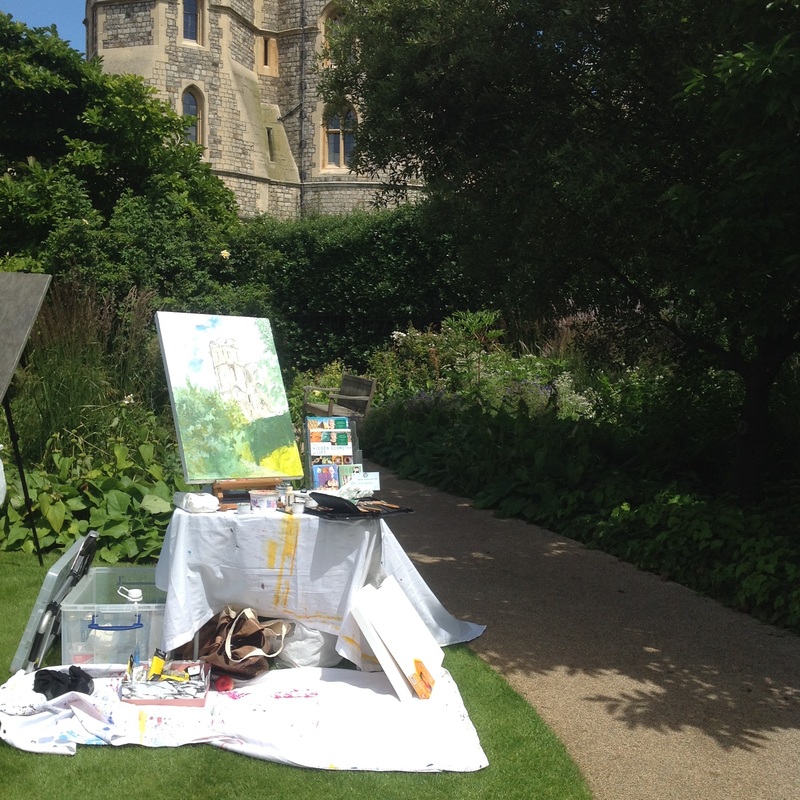
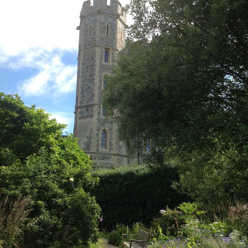
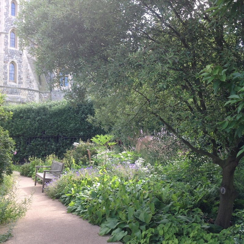
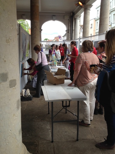
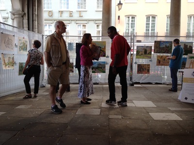
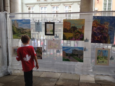
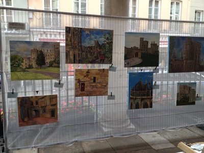
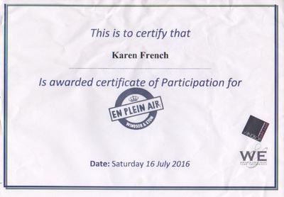
Oxfordshire Artweeks celebrated its 40th year in 2022 and the turnout to all the art exhibitions in May was incredible! Thank you to everyone that came to The Spice of Life, behind the Spice Lounge restaurant in Summertown. It was wonderful to be able to exhibit 'Porthole', 'Sun Light Codes' and 'Sacred Geometry Bots' from my Spring Collection - Circular exploring the sacred geometry of the circle and colour symbolism, as well as some older favourites. It was a unique experience painting with acrylics in torrential rain showers during this year's En-Plein in Windsor. As painting en-plein is a rare experience for me I took improvised rain cover, which was not sufficient for the heavy rain and wind. Regulars had an array of quite amazing kit that kept them dry, such as an umbrella with a zip-on sheet to make a cosy shelter. My painting was literally washed off twice, as I battled to dry it in-between each downpour. So instead I did a high speed pen drawing but it got to the point that my hands were so cold they were shaking. Another shower and more wind send me packing to the welcome shelter of Windsor town centre. My resulting piece is not polished but I like the ghostly image of a smaller shadowed castle within the larger drawing. At the beginning, in the sunshine, I was going to do a smaller castle with its windows and more of the formal east garden, but soon realised I wasn't going to have sufficient time outside to complete so much detail. It is a rare privilege to be able to go into the east gardens of Windsor Castle. These are the Queen's private gardens where she walks her corgis. A dog bowl of water by the stairs was a reminder of this. I chose to paint in these gardens because of the formal geometry used in their design. These three images are (left to right): Canvas ready to go, my view through scaffolding, stock image of the east gardens. These pictures are my washed off painting on the left to which I added some colour. This year all the entrants' paintings were displayed under cover in the Windsor shopping area by the station. A line of easels ran along the shop front windows and made a very interesting display. Many people had a close look and voted on their favourite painting.
Overall a throughly enjoyable day as it was artistically challenging and sociable.
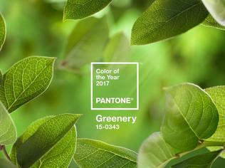
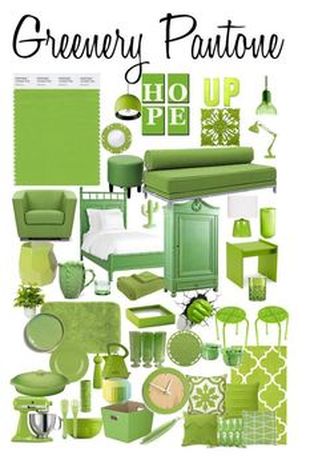
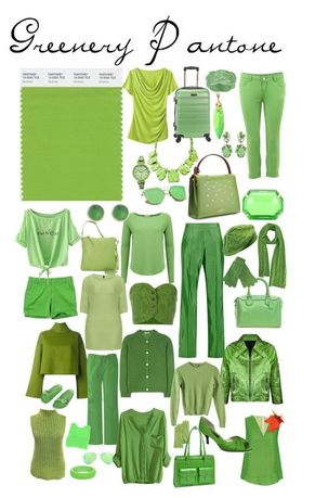
GREEN symbolism Known as the ‘fulcrum colour’, green is the midway colour on the spectrum. Neutral in temperature, green brings physical equilibrium where positive and negative are balanced. Green has a strong kinship with Nature, helping us connect and empathise with others and the natural world. Instinctively we seek green when under stress as it creates a feeling of relaxation, calmness, space and balances the emotions. Because of this green is one of the major healing colours. In Buddhism, vernal green is the colour of life and pale green the kingdom of death and everything pertaining to death. In Christianity, vernal green represents immortality and hope, the growth of the Holy Spirit within humans, life and spring. Green was the colour of the Trinity and the Epiphany in Medieval times. For Celts, green symbolised the Earth Goddess. Green marked the beginning of the ‘Great Work’ for alchemists and was used in preparation for transmutation of base metals into gold. Green symbolism, extract from 'The Hidden Geometry of Life'. Greenery is a fresh and zesty yellow-green shade that evokes the first days of spring when nature’s greens revive, restore and renew. Illustrative of flourishing foliage and the lushness of the great outdoors, the fortifying attributes of Greenery signals consumers to take a deep breath, oxygenate and reinvigorate. Greenery is nature’s neutral. The more submerged people are in modern life, the greater their innate craving to immerse themselves in the physical beauty and inherent unity of the natural world. This shift is reflected by the proliferation of all things expressive of Greenery in daily lives through urban planning, architecture, lifestyle and design choices globally. A constant on the periphery, Greenery is now being pulled to the forefront – it is an omnipresent hue around the world. A life-affirming shade, Greenery is also emblematic of the pursuit of personal passions and vitality.
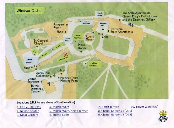
Up the Hill! was the result of 5 hours of non-stop painting and a 4pm dead-line. It was intense! Unfortunately I didn't manage to finish but was close enough. Having painted abstract and conceptual for a few years it was strange to be painting a structured building again. I was on Tower Hill (red X on map) and positioned myself in shade for most of the day; many other artists boiled in the sun and there were a few of cases sunburn. A pop-up exhibition followed and presentation of prizes by the Windsor Mayor. All the artists were treated to a delicious buffet and drinks. It was great fun and I look forward to next year!
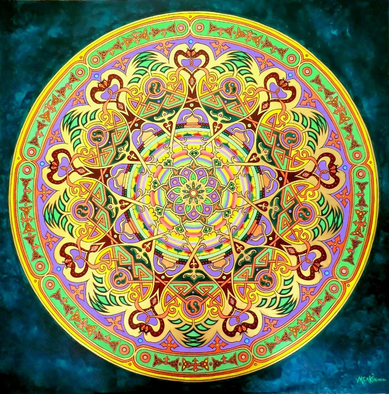
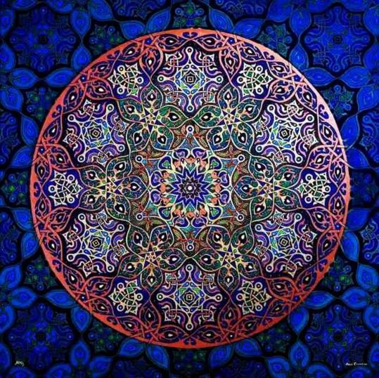
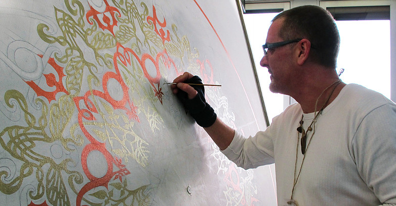
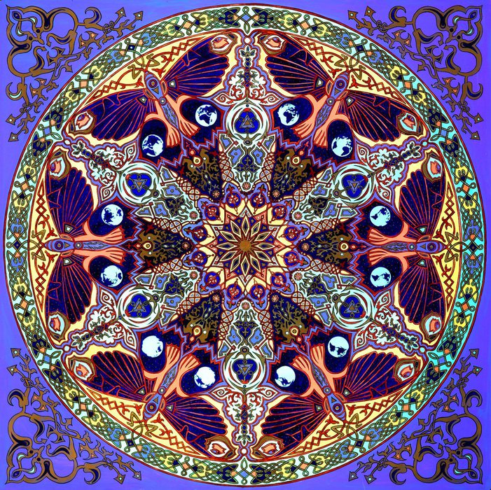
Having had the pleasure of having a stand next to Stephen Meakin and after seeing his work at other events I really wanted to share his talent with you. Stephen's mandalas are stunning! Vibrant colours, intricate detail and powerful symbolism. I highly recommend a visit to his website www.themandalacompany.com to see more of his work and how he creates his large masterpieces.
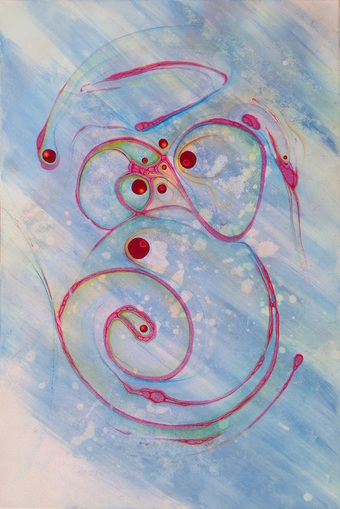
Just finished Seeds of Ideas! (thin canvas 76 x 50.5cm, acrylic) Representing the way ideas pop into our awareness then bubble, jostle and blend together in novel and unpredictable ways.
Today I discovered the Swedish artist Wilma af Klint (1862 - 1944) and was thrilled by her beautiful abstract art of sacred geometry. She produced nearly 1200 pieces and insisted they were not put on public view until at least 20 years after her passing. Interestingly, many of her abstract compositions pre-date Kandinsky. 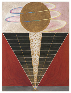 Throughout her abstract work is a genuine desire to understand and reveal the spiritual through her painting. Many of her paintings were like 'diagrams' and represent complex spiritual ideas. Essentially they are like Yantras, or 'thought-forms', and are representations of abstract concepts. I went to see her exhibition on the 27th April and it was outstanding! It has inspired me to do LARGE pieces. Not sure how or where yet... The Serpentine Galleries in London is holding an exhibition of her art right now from 3rd March - 15th May 2016. 20th February 2017
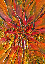 I have discovered Pebeo mixed media, such as foil and all sorts of other goodies! As well as using these on some of my new pieces of art I am revisiting one or two my older paintings that I feel were not 'finished'. An example of green foil is in this central detail from Communicate With Passion. |
Archives
December 2023
Categories
All
|
Gateway to the Heavens Do you realise you actually shape your destiny and shapes influence your destiny. If you want to understand how this works ask Karen to give a talk about it or read her excellent book. You may have hated even the mention of geometry at school, but Karen's simple and illustrated explanations will give you a real insight into this fascinating topic. |
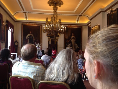
The Hidden Geometry of Life The attentive audience was enthralled by Karen's introduction to the principals of this truly multi-dimensional topic ... The energy in the room, by the end of the evening, was well and truly charged! |

 RSS Feed

