|
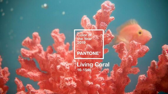
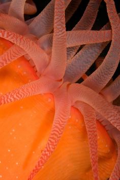
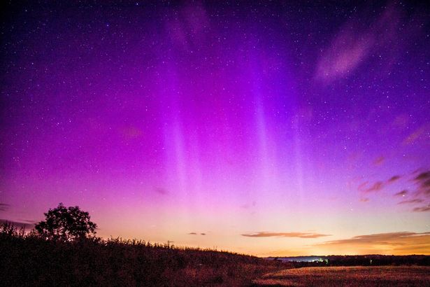
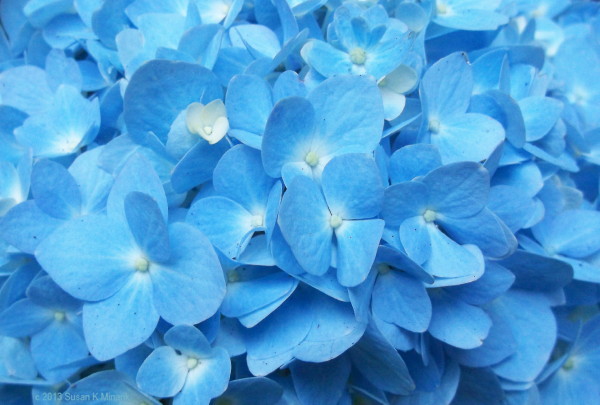
'Living' pink with mellow yellow-gold undertones characterises Living Coral, Pantone Colour of the Year 2019, far softer than the vivid Ultra Violet of 2018. Certainly it brings some warmth to somewhat chilly times and draws our attention to the stunning beauty of the natural colours within the world of the fragile coral reefs.
0 Comments
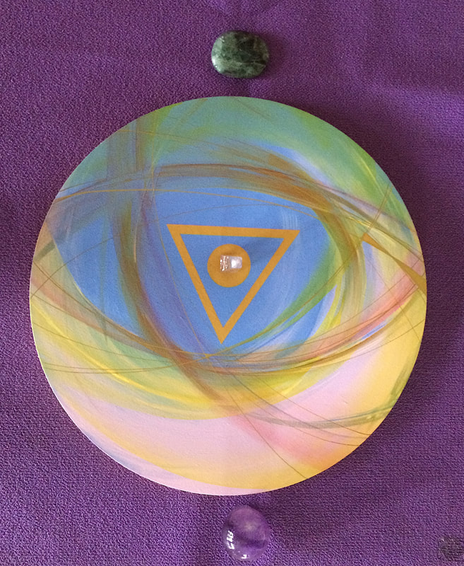
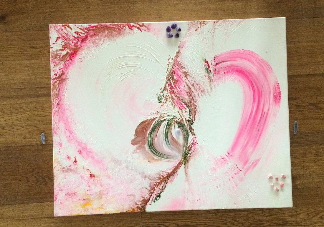
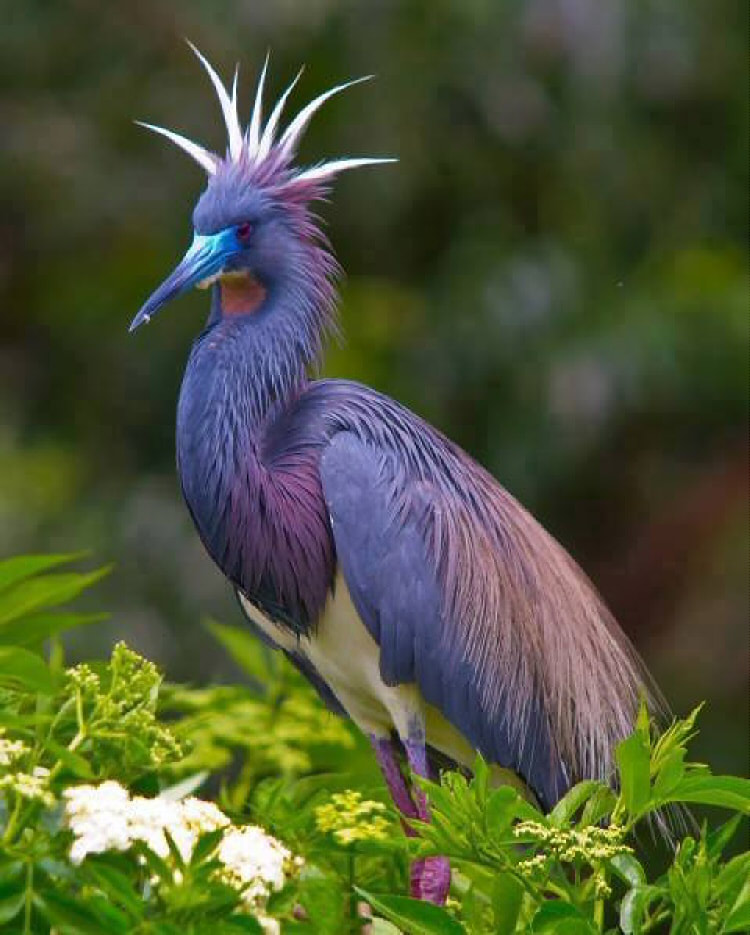
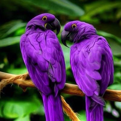
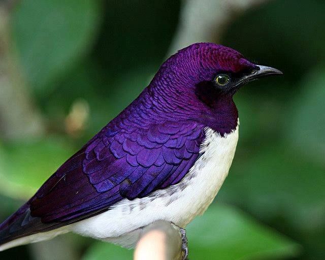
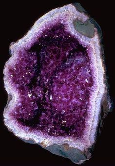
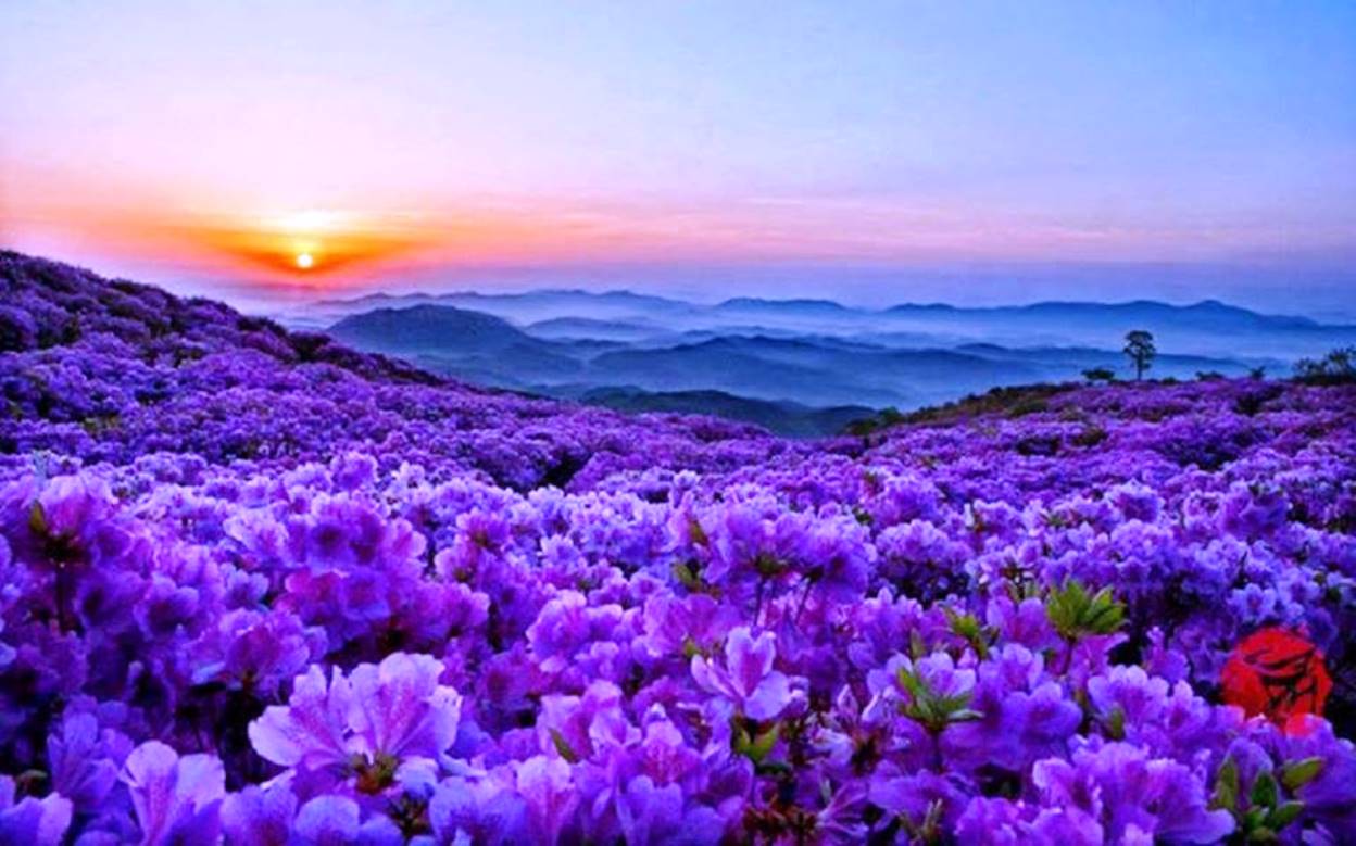
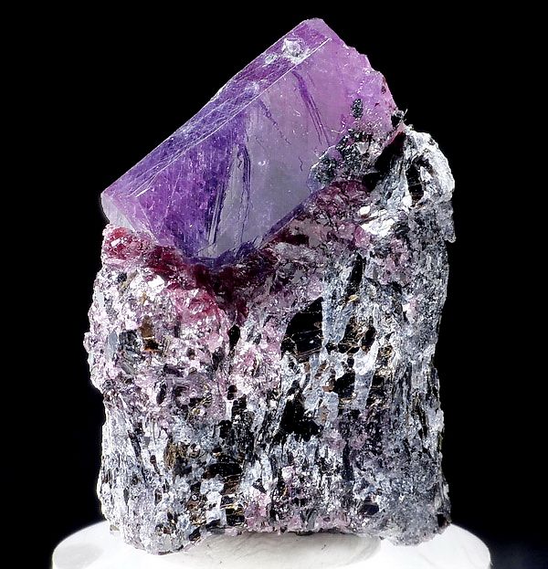
Alchemical artAlchemical Art is transformative, changing anyone who works with them. This can happen merely by looking at the artwork or being in its proximity. Each piece is contained within the sacred space of its boundaries and is a fusion of the dynamics of geometric forms, emotive colours and one or more of the Classical Elements. The latter may be symbolically represented in the image or made out of specific materials due to their symbolism or vibration. In this instance crystals were placed on four paintings of my alchemical art paintings to incorporate their qualities. The results were stunning to look at and to work with. It would have been interesting to add further Elements, such as bowls of water and burning essence for air and fire, and also to use sound to activate them. Each of the alchemical art crystal grids were made by some participants of a crystal group run by Karin Bain. Karin has written an e-book called Networking With Crystals that will soon be available in paper form as well. Crystal GridsCrystal grids take many forms, they can be simple, intricate or complete. Invariably there is sacred geometry in their layout and so they are actually a yantra, or "thought form", the principle of all man-made sacred geometry artworks and structures. By adding the vibrations of specific crystals the crystal grid yantra becomes a pulsating vehicle for connecting your Mind to the underlying basis of reality. The effects are very personal. Yantras are covered in detail in The Gateway Series books and I also recommend the book Yantra by Madhu Khanna. Any sacred site using sacred geometry and specific earth materials brings additional vibrational qualities to their function and use. For example, Stonehenge and its bluestone rocks that were deliberately brought a great distance for their vibrational purposes. In the aerial image below notice how the central stone grid is enclosed within a larger Circle. It is part of a larger site that has several smaller yantra that all work together. This sacred structure is a huge crystal yantra that still has the capacity to draw thousands of people to it. 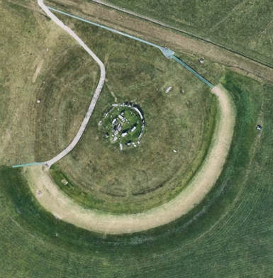 Aerial view of Stonehenge (Google Earth) Regal mauve-purple, colour of limitless creativity and insight, is a stunning feature of nature's creations. Since my blog on Pantone's colour for 2018 I was intrigued to see how often nature used this stunning colour, especially since it was rare and expensive as a dye for such a long time and hence limited in its use by humans. A stunning purple violet 18-3838 is the PANTONE colour for 2018. Tyrian (Imperial) purple tones were made out the secretion of predatory sea snails and used to be extremely expensive to produce, hence purple's association with royalty and special ceremonies. Purple became an affordable dye around 1856 when the English chemist William Henry Perkin, aged 18, noticed that a compound from synthesised quinine dyed fabrics purple. He patented it, calling it anilin purple, and made a fortune from it. Then in 1859 the colour was renamed 'mauve' after the French name for the purple mallow flower (and the dye compound was named mauveine). Interestingly, it is only recently that purple printing has featured more on product packaging as the main colour. 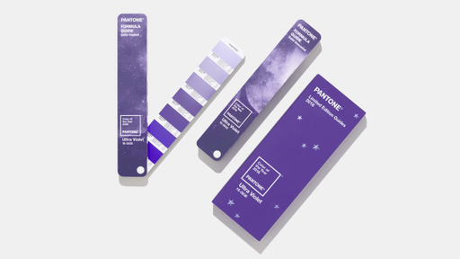 Complex and contemplative, Ultra Violet suggests the mysteries of the cosmos, the intrigue of what lies ahead, and the discoveries beyond where we are now. The vast and limitless night sky is symbolic of what is possible and continues to inspire the desire to pursue a world beyond our own. 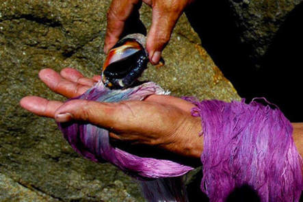
GREEN symbolism Known as the ‘fulcrum colour’, green is the midway colour on the spectrum. Neutral in temperature, green brings physical equilibrium where positive and negative are balanced. Green has a strong kinship with Nature, helping us connect and empathise with others and the natural world. Instinctively we seek green when under stress as it creates a feeling of relaxation, calmness, space and balances the emotions. Because of this green is one of the major healing colours. In Buddhism, vernal green is the colour of life and pale green the kingdom of death and everything pertaining to death. In Christianity, vernal green represents immortality and hope, the growth of the Holy Spirit within humans, life and spring. Green was the colour of the Trinity and the Epiphany in Medieval times. For Celts, green symbolised the Earth Goddess. Green marked the beginning of the ‘Great Work’ for alchemists and was used in preparation for transmutation of base metals into gold. Green symbolism, extract from 'The Hidden Geometry of Life'.
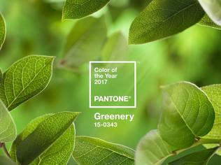
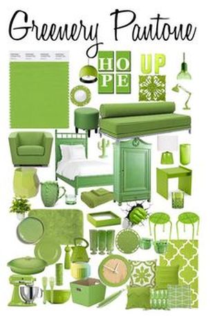
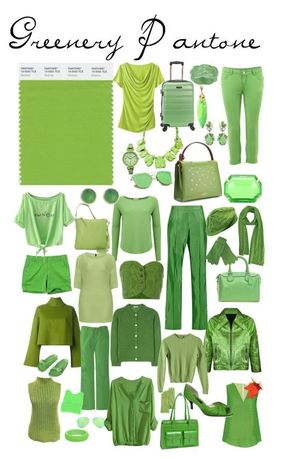
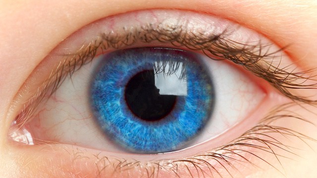
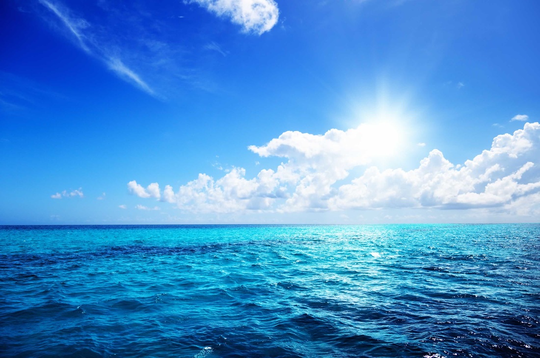
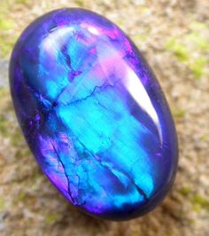
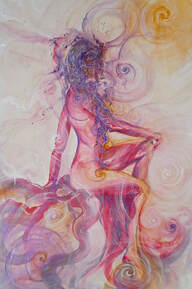
Greenery is a fresh and zesty yellow-green shade that evokes the first days of spring when nature’s greens revive, restore and renew. Illustrative of flourishing foliage and the lushness of the great outdoors, the fortifying attributes of Greenery signals consumers to take a deep breath, oxygenate and reinvigorate. Greenery is nature’s neutral. The more submerged people are in modern life, the greater their innate craving to immerse themselves in the physical beauty and inherent unity of the natural world. This shift is reflected by the proliferation of all things expressive of Greenery in daily lives through urban planning, architecture, lifestyle and design choices globally. A constant on the periphery, Greenery is now being pulled to the forefront – it is an omnipresent hue around the world. A life-affirming shade, Greenery is also emblematic of the pursuit of personal passions and vitality. Every image I create is imbued with symbolism - sacred geometry of shapes and patterns, light and colours, flowers, animals, Gods & Goddesses… All are visual expressions of the science manifesting reality. Images for connecting into with your Mind to enhance your experience of reality. To see more in my abstract and conceptual art look beyond the surface images and think of them as a 'thought forms' to blend into and work with. I often post one of my pieces with a short interpretation and insight for that day. As examples here are a couple that I posted on my facebook page in December 2016. Enjoy! Infinity and EmotionsEmotions colour our lives. Every time you are triggered by events in your life to feel blue (sadness), see red (anger, hate), feel green (with envy).... they happen to reflect back and show you the inner work you need to do along the Spiral path towards the inner, central Self where unconditional Joy is experienced. Look at the subtle images within the paintings, which were not created intentionally. For example I see a swan at the centre. Swans symbolise grace, the awakening power of the inner Self, balance, inner beauty and the 'rising glory' of a new day. 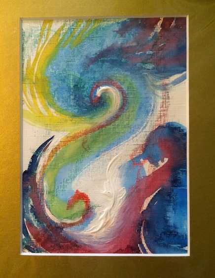 Unfurling PotentialAs 2017 approaches here is a thought for the new year. Allow your potential to unfurl to reveal you in all your splendour. Awaken your senses, exeperience the colours of life and learn from them. 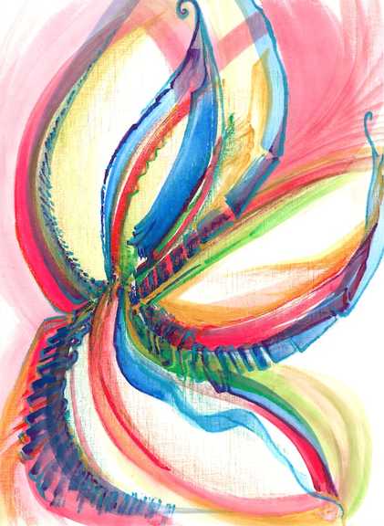 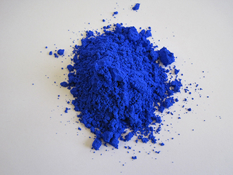 A startling blue durable pigment called YInMn blue has been licensed for commercial use 7 years since its discovery and it has already found its way into the hands of some artists. Chemist Mas Subramanian and his team discovered the pigment in 2009 at Oregon State University while they were conducting experiments connected to electronics. It is one of those 'happy accidents', an unexpected discovery like Bluetac! With a unique crystal structure the compound doesn't fade, even when exposed to oil or water, and it is environmentally friendly. "Ever since the early Egyptians developed some of the first blue pigments, the pigment industry has been struggling to address problems with safety, toxicity and durability,” said Subramanian (existing blue pigments include ultramarine, made from ground lapis lazuli, and toxic alternatives such as cobalt blue and Prussian blue). "Now it also appears to be a new candidate for energy efficiency,” Subramanian adds, referring to the colour’s ability to reflect light and potentially keep buildings cool. The Shepherd Color Company is involved in commercialising this exciting new pigment. Can you see its vibrant blue hue? Recent evidence suggests that that, until modern times, humans didn't see the colour blue at all! In an interesting article in Business Insider, Kevin Loria breaks down the evidence behind the claim, which dates all the way back to the 1800s when scholar William Gladstone noticed that, in The Odyssey, Homer describes the ocean as 'wine-dark' but he never uses the word 'blue'. Every language first had a word for black and for white, or dark and light. The next word for a colour to come into existence, in every language studied around the world, was red, the colour of blood. After red, yellow appears and then green. Finally blue appears in every language. The only ancient culture with a word for blue was the Egyptians, they were also the only people that had a way to produce a blue dye. So before blue became a common concept we may have seen it, but not known we were seeing it. Blue is rare in nature. Even the sky or bodies of water (like a lake) aren't blue often. Philologist Lazarus Geiger’s research shows that even in scriptures describing 'the heavens' still don’t necessarily see the sky as 'blue'. Jules Davidoff traveled to Namibia to investigate and conducted an experiment with the Himba tribe, who speak a language that has no word for blue or distinction between blue and green. He discovered they couldn't pick out blue from green, but could discern very subtle shades of green that were not visible to most of us. Another study by MIT scientists in 2007 showed that native Russian speakers have a word for light blue (goluboy) and dark blue (siniy), and can discriminate between light and dark shades of blue much faster than English speakers.
|
Archives
December 2023
Categories
All

|


 RSS Feed
|
Gateway to the Heavens Do you realise you actually shape your destiny and shapes influence your destiny. If you want to understand how this works ask Karen to give a talk about it or read her excellent book. You may have hated even the mention of geometry at school, but Karen's simple and illustrated explanations will give you a real insight into this fascinating topic. |
The Hidden Geometry of Life The attentive audience was enthralled by Karen's introduction to the principals of this truly multi-dimensional topic ... The energy in the room, by the end of the evening, was well and truly charged! |