What Do We Know?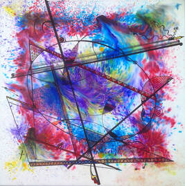 COSMIC EGG COSMIC EGG What Do We Know is a new, international, virtual art exhibition from 3-30 June exploring Spiritual art and its multitude of feelings, experiences, viewpoints and forms of expression. Curated by Art Director and Visual Artists Association Mentor, Karen van Hoey Smith. What Do We Know features nine international artists who all work from a deeper space; moving past the noise of modern life to create a physical form of an external presence. The word ‘Spiritual’ has been hijacked to elicit different meanings and reactions. By coming together, these 9 artists ask what does Spiritual really mean, can one word describe a multitude of feelings, experiences, viewpoints and forms of expression, and is ‘Spiritual’ the word to describe this movement? 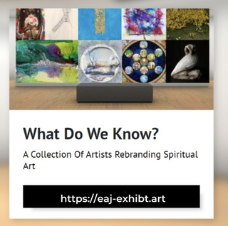 Ana Delgado - photographer living and working in Brooklyn, New York E. Alana James, EdD - digital collage artist living in Ireland Karen French - author, painter and speaker living in Oxfordshire, UK Kirsten Todd - painter, medium and Reiki Master/Teacher living in Lancashire, UK Kristen Palana – American-Portuguese multidisciplinary artist based in Malawi Ozlem Yikici – British-Turkish painter living and working in London, UK Sadie Bridger - multimedia artist in New York City Sarah Brabbin - sculptor living in the UK Vicky Paul – Scottish artist, intuitive and energy healer based in Bedford, UK
Featuring a variety of styles and meanings, from visual art to photography and sculpture, these artists share the ability to stop or remove themselves from the noise of life, called to make the unseen seen. By placing the variety of styles and meanings together, What Do We Know aims to open up conversation about the inner state that starts creativity and makes that first mark. Most artists that cite Spiritual or Intuitive as the source of their creative process have been advised to keep that quiet, as if there is some kind of shame or embarrassment associated with sharing the truth around their practise. Eleanor Heartney comments in her 2020 essay in ArtWorld that there is now an acknowledgement that previous art movements were inspired and created from a Spiritual basis, and that other modern artists have their stated points of reference, but “none of this has gelled into a collective movement”. Karen van Hoey Smith (curator) What Do We Know is not about creating a collective or a movement. It is the beginning of open-minded humans who wish to explore and converse about the inner state that starts creativity and makes that first mark. Is this purely living in the present and innocence prevails? Or are these artists channelling parts of their brain and psyche that are unknown to them in their daily lives? This exhibition is about having the courage to explore what Spiritual is, so that it can be held as an honourable banner and part of these artists’ practise, life and inspiration. It is also an invitation to the public, and the art community, to appreciate the presence of a non material realm as a genuine source of motivation and inspiration. Karen van Hoey Smith (curator) WRITTEN BY Vicky Paul
0 Comments
Design and Form: The Basic Course at the Bauhaus by Johannes Itten Thames and Hudson 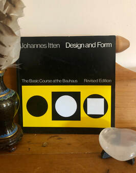 Recommended Read 'Design and Form: The Basic Course at the Bauhaus' by Johannes Itten (1888 - 1967), published by Thames and Hudson. A very interesting book into some of the basic theories of colour, tone and shape that were taught at the highly influential Bauhaus school, in the earlier part of the century. Most of the book comprises of images of artwork from artists of the time. Johannes Itten was a Swiss artist, writer, teacher and theorist and was part of the Expressionistic movement. He was Mazdaznan, a strict vegetarian and meditated to develop inner understanding and intuition. Originally he trained as a school teacher incorporating new theories of teaching, notably including the practice of not correcting his students' creative work individually, so as not to crush their creative impulse. He chose certain common mistakes to teach the whole class. From the influence of Hölzel, Itten chose a series of basic shapes (the line, the plane, the circle, the spiral) as a means from which to begin creation. His students did gymnastic exercises before class to relax! Later music and other relaxation techniques. Itten had a HUGE influence on the use of colour in modern art and even the cosmetics industry. He taught the preliminary course at the innovative Bauhaus from 1919 to 1922 - the basics of material characteristics, composition, and colour. He theorised 7 types of colour contrast. These were hue, value, temperature, complements, simultaneous contrast (Chevreuil), contrast by saturation, contrast by extension.
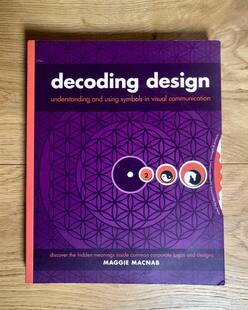
Decoding Design by Maggie Macnab How Design Books
DESIGN OBSERVER - Maggie Macnab founded Macnab Design in 1981 and received highest honors from the American Advertising Federation ADDY for logo design in 1983. She has continued to receive national and international recognition for creating design that focuses on meaning, beauty and usefulness. Her unique approach integrates symbolic information into design to create effective and accessible visual communications that translate into any language and any culture.
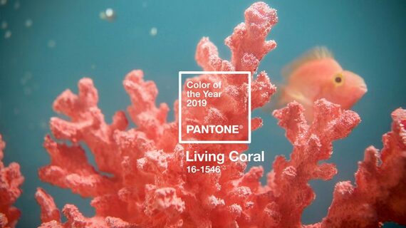
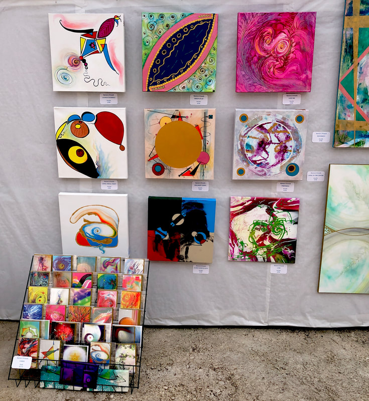
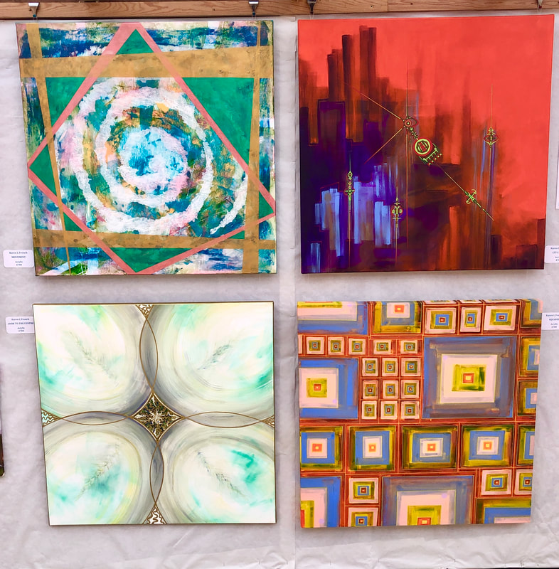
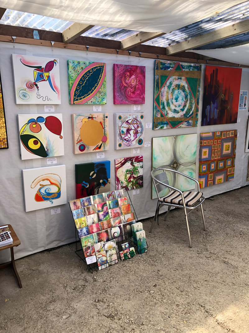
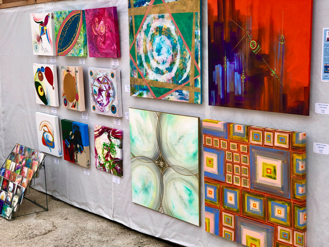
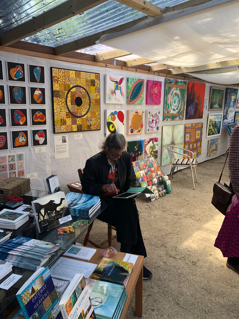
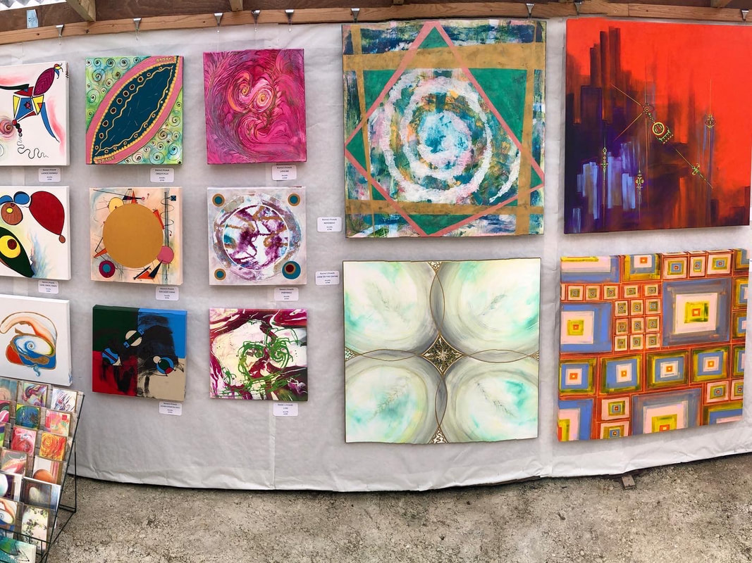
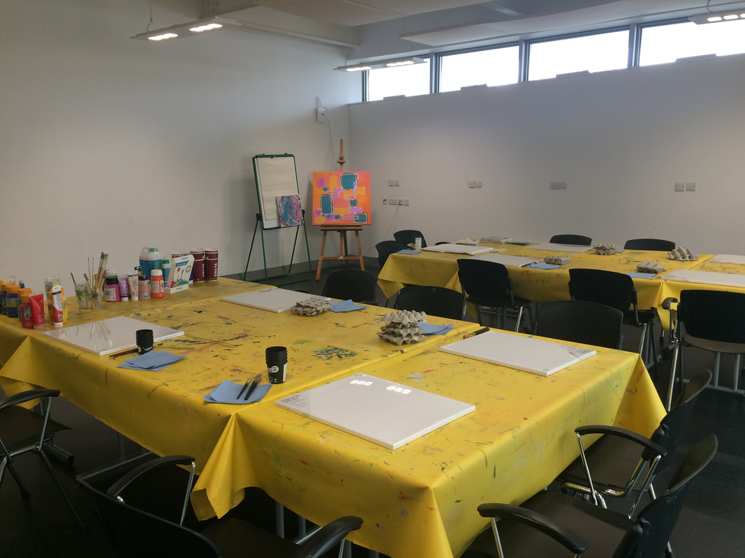
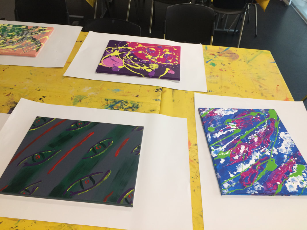
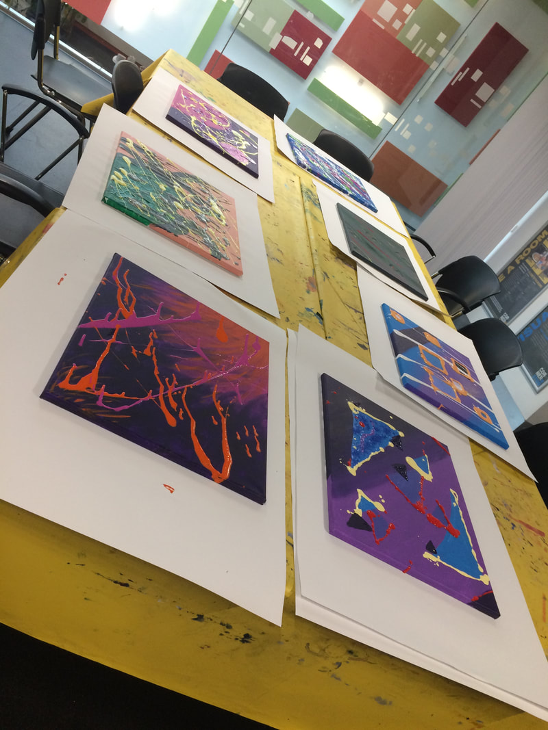
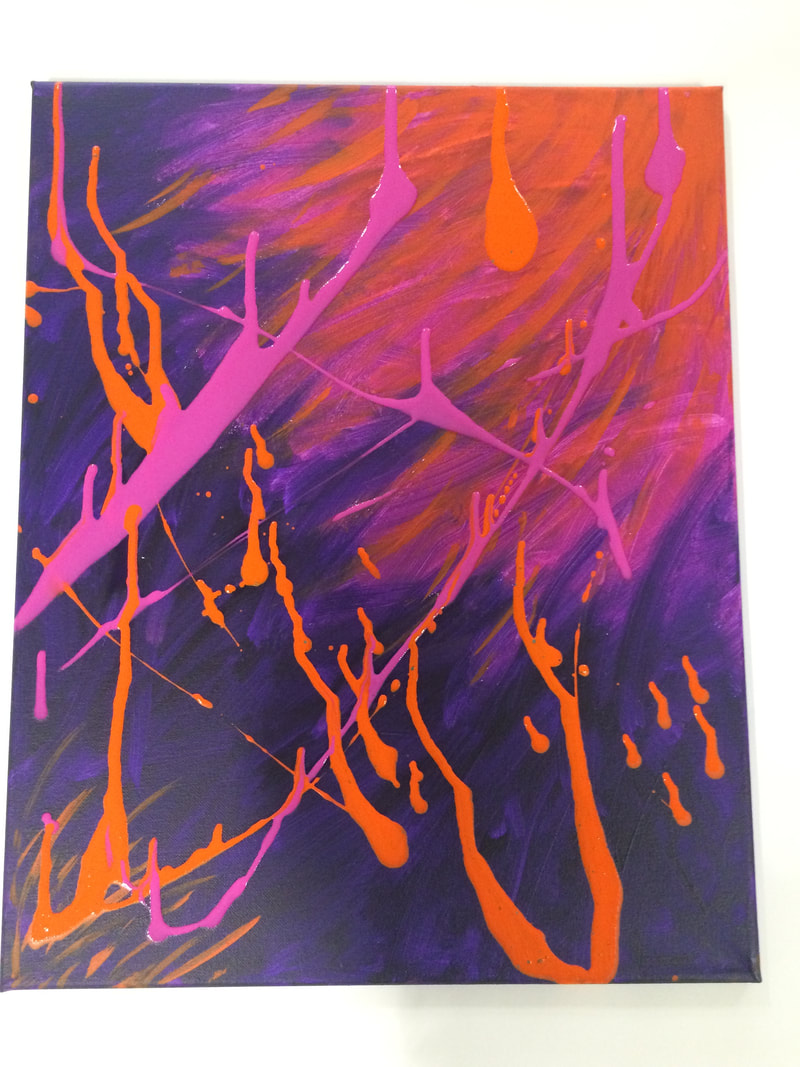
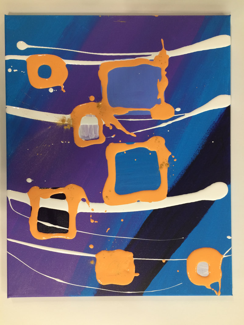
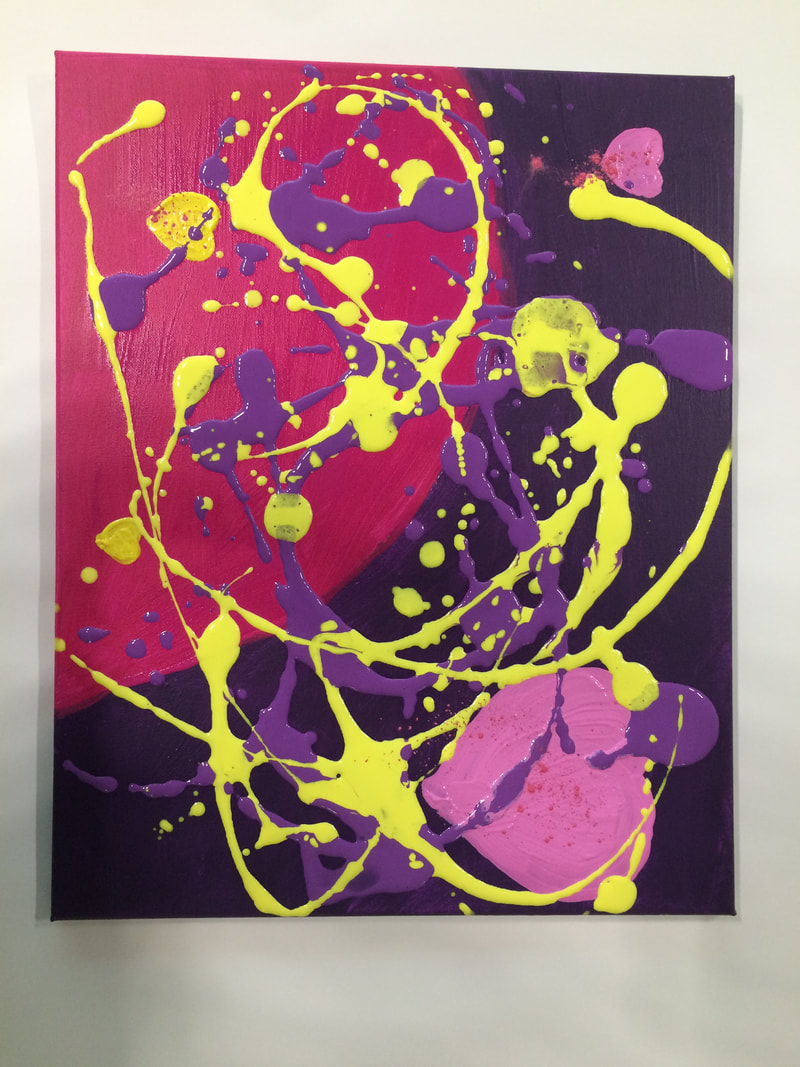
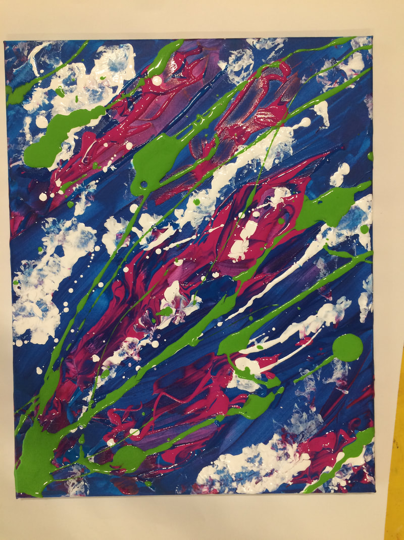
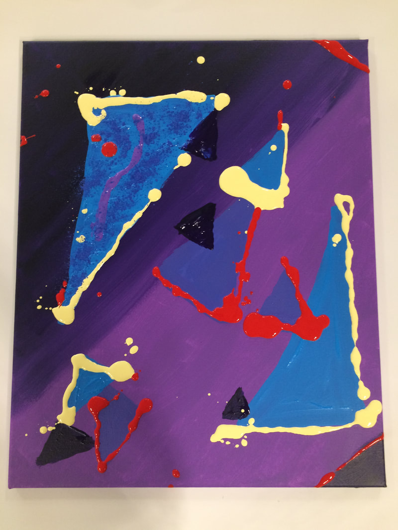
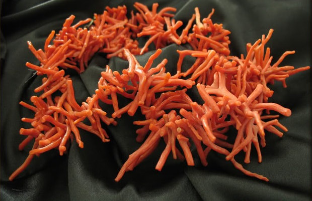
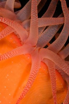
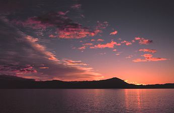
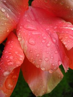
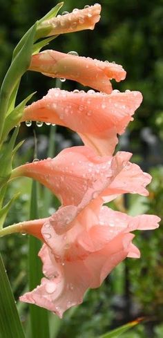
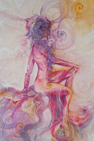
Oxfordshire Artweeks celebrated its 40th year in 2022 and the turnout to all the art exhibitions in May was incredible! Thank you to everyone that came to The Spice of Life, behind the Spice Lounge restaurant in Summertown. It was wonderful to be able to exhibit 'Porthole', 'Sun Light Codes' and 'Sacred Geometry Bots' from my Spring Collection - Circular exploring the sacred geometry of the circle and colour symbolism, as well as some older favourites. 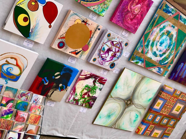 Paint Along With KarenAt Cornerstone Arts Centre (on 14th March 2020) I ran a Paint Along With the Artist workshop as part of International Women's Week. Using acrylics has the main benefit of drying fairly quickly so we could add layers and do some acrylic flow with some success. The them was going to be zoning areas of square blocks but it became very apparent that I could not 'box' people into doing this. Instead I encouraged different shapes of colour areas. Acrylic flow then integrate or differentiated these zones, plus it added an element of chaos to the order. This certainly contributed to energising the artworks, which were very static. 'Expression' by Karen L French 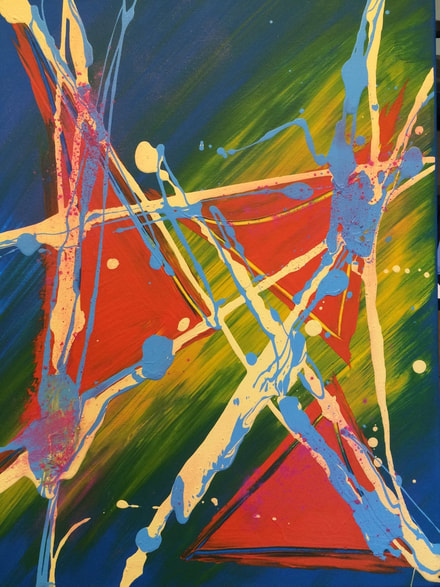 Well done to the 7 artists for their stunning 'expressions' of themselves! 'Living' pink with mellow yellow-gold undertones characterises Living Coral, Pantone Colour of the Year 2019, far softer than the vivid Ultra Violet of 2018. Certainly it brings some warmth to somewhat chilly times and draws our attention to the stunning beauty of the natural colours within the world of the fragile coral reefs.
|
Archives
December 2023
Categories
All

|
||||||||||||||||||||||


 RSS Feed
|
Gateway to the Heavens Do you realise you actually shape your destiny and shapes influence your destiny. If you want to understand how this works ask Karen to give a talk about it or read her excellent book. You may have hated even the mention of geometry at school, but Karen's simple and illustrated explanations will give you a real insight into this fascinating topic. |
The Hidden Geometry of Life The attentive audience was enthralled by Karen's introduction to the principals of this truly multi-dimensional topic ... The energy in the room, by the end of the evening, was well and truly charged! |